Why a 94.7%-accurate smish classifier is a false-positive machine in production
You have seen the pitch: a classifier hits 94.7% accuracy on a public SMS dataset, so it is ready for the network. The number is real. The conclusion is not.
Accuracy answers the wrong question for fraud and abuse. It blends two worlds (how often smishing actually appears in traffic, and how the model behaves when it does) into a single headline. Change only the first, keep the model fixed, and the number that ops teams live with (precision on alerts) can fall off a cliff.
The chart above is one picture that makes that argument stick. You can reuse it every time someone says, “But the model is 94.7% accurate.”
What the curve is showing
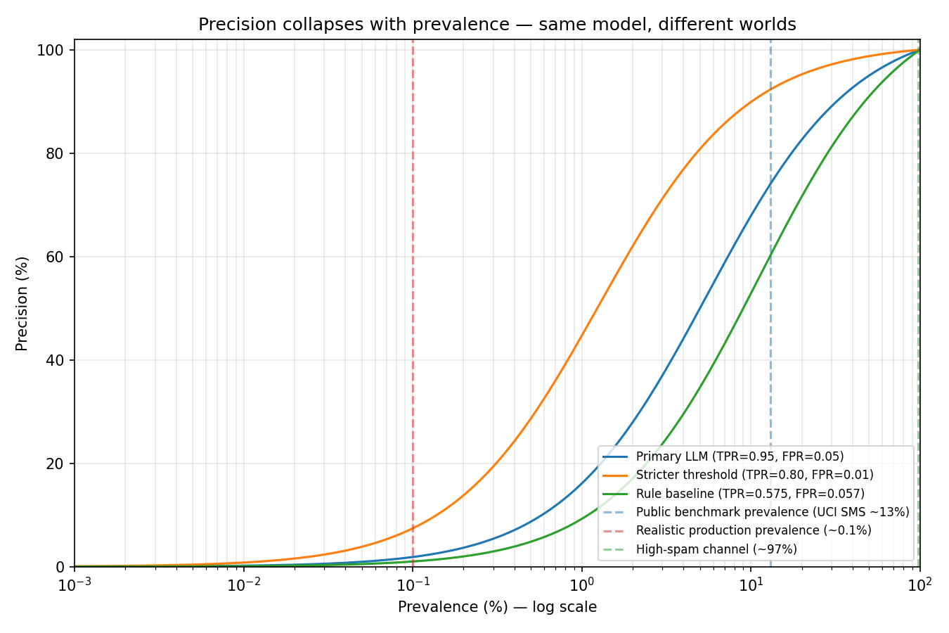
The figure plots precision (vertical axis) against prevalence (horizontal axis, log scale).
- Prevalence is the fraction of messages that are genuinely smishing. Public spam benchmarks often sit around 13% (UCI SMS Spam Collection). A filtered enterprise or carrier SMS channel might see on the order of 0.1%. A honeypot or abuse sink can approach 97% spam.
- Precision answers: When the model raises a smishing alert, how often is it right?
Three model curves are drawn. Each is defined by two numbers that do not depend on prevalence:
Primary LLM — TPR (recall) 0.95, FPR 0.05. Strong catch rate; moderate false alarms on legit SMS.
Stricter threshold — TPR 0.80, FPR 0.01. Sacrifices recall; much fewer false alarms.
Rule baseline — TPR 0.575, FPR 0.057. Heuristic baseline from a public smishing eval.
TPR (true positive rate) is the share of real smishing the model flags. FPR (false positive rate) is the share of legitimate SMS it wrongly flags. Those rates come from a confusion matrix on a fixed test set. They describe the classifier. They do not describe your production inbox.
The vertical dashed lines are not scores. They are where people usually measure versus where systems usually run.
The math in one line (and why it bites)
Hold the model fixed. Let p = prevalence. Then:
Precision(p) = (TPR x p) / (TPR x p + FPR x (1 - p))
Read it slowly.
- The numerator is true smishing caught: it scales with p. Rare smishing means a tiny numerator.
- The denominator adds false alarms on legitimate traffic: FPR x (1 - p). When smishing is rare, (1 - p) is close to 1, so that term barely shrinks.
So as p falls, precision does not gently decline. It collapses, unless FPR is essentially zero. As p approaches 100% spam, precision approaches 1 trivially. The curve is not a quirk of one vendor; it is Bayes’ rule wearing a fraud-ops uniform.
Three things the chart proves at a glance
1. Headline accuracy is measured at the wrong x-value
The public-benchmark line (about 13% prevalence) sits in the easy part of the chart. For the primary LLM curve, precision there is about 74%: roughly three in four alerts are real smishing.
The production line (about 0.1% prevalence) sits in the catastrophic zone. Same TPR and FPR, precision is about 2%: roughly one alert in fifty is real smishing. The rest are false positives on legitimate messages (OTP codes, bank notifications, delivery updates).
That is roughly a 75 percentage-point swing without retraining a single weight. Same model. Different world.
Overall accuracy on a balanced or spam-heavy test set can still look excellent (about 95%) because most examples are legitimate and most predictions are correct. Accuracy hides the operational pain: volume of false alerts when the positive class is rare.
2. A worse model can be the better production choice
Compare the blue curve (high recall, FPR 5%) to the orange curve (lower recall, FPR 1%).
On a leaderboard at benchmark prevalence, blue wins: higher recall, “better” model.
At 0.1% prevalence, orange sits above blue. When smishing is rare, shaving false positives matters more than catching the last few attacks. The model with the nicer headline is the worse deployment choice.
That inversion is not paradoxical. It is the chart telling you to optimise specificity on legitimate traffic (low FPR) when the attack is rare, not benchmark accuracy.
3. High-spam channels live on the other side of the cliff
At 97% prevalence, every curve hugs the top of the chart. Precision-on-smish looks great for everyone.
That is why there is no universal fraud metric. On a clean channel, the rare class is smishing; watch false positives on legit. On a spam sink, the rare class might be ham or legit mail; flip the framing. Pick the metric for the surface, not the slide deck.
A worked example at 0.1% prevalence
Take the primary LLM: TPR = 0.95, FPR = 0.05, p = 0.001 (0.1%).
Precision = (0.95 x 0.001) / (0.95 x 0.001 + 0.05 x 0.999)
That is about 0.00095 / 0.0509, or about 1.9%.
Translate to volume. Suppose the channel sees 10 million SMS per day and 0.1% are smishing:
- 10,000 real smishing messages; the model flags 9,500 of them (95% recall).
- 9,990,000 legitimate messages; 5% false-alarmed gives 499,500 false positives on legit traffic.
Alerts are about 509,000 per day. True smishing alerts are about 9,500. Precision is about 1.9%.
Ops is not debating whether 94.7% “sounds good.” They are staffing a queue that is 98% noise. That is the significance of the curve.
Sanity check: same model, different prevalence
Primary LLM (TPR = 0.95, FPR = 0.05):
- 0.01% prevalence (extreme tail risk) — precision about 1.9%
- 0.1% prevalence (clean production channel) — precision about 1.9%
- 1% prevalence (elevated abuse) — precision about 16%
- 5% prevalence (active campaign) — precision about 50%
- 13% prevalence (UCI SMS Spam-style benchmark) — precision about 74%
- 50% prevalence (balanced lab set) — precision about 95%
- 97% prevalence (high-spam sink) — precision about 99.8%
The model did not get worse between rows. p changed.
What this means for evaluation design
Public smishing and spam benchmarks still matter. They stress-test reasoning, variants, and recall on labelled attacks. But a single accuracy column is incomplete without asking:
- What prevalence does this benchmark imply? (About 13% spam in UCI SMS is not a carrier feed.)
- What are TPR and FPR on legitimate traffic? Report the confusion matrix; derive rates.
- What prevalence will deployment see? If you do not know, scenario-plan: sweep p on the chart or in a spreadsheet from 0.01% to 10%.
- Which metric matches the surface? Rare attack: prioritise low FPR on legit. Spam-dominated sink: precision on the majority class may be fine.
The smishing-eval repo (https://github.com/thecommlayer/smishing-eval) includes a reproducible script precision_vs_prevalence.py that generates the figure from fixed TPR/FPR pairs or from eval JSON. The technical note README_metric_note.md in the same repo walks through the formula and baseline derivation.
The sentence to take away
Accuracy is not a property of the model alone; precision at alert time is a joint property of the model and the prevalence of attacks in the channel.
The curve makes that joint property visible. Once you have seen the gap between the benchmark line and the production line, you cannot un-see it, and you should not have to explain it from scratch in every roadmap review.
Further reading (public sources)
- UCI SMS Spam Collection: https://archive.ics.uci.edu/dataset/228/sms+spam+collection (common benchmark; about 13% spam in the held-out set).
- Precision and recall (Wikipedia): https://en.wikipedia.org/wiki/Precision_and_recall
- My smishing eval harness: https://github.com/thecommlayer/smishing-eval (see README and eval.py in the repo).